07/09/25
5 Minute Read
The Evolution of the Adidas Logo

Logos are never just shapes on a page; they’re living symbols that carry decades of meaning, memory, and identity. Few brands prove this better than adidas, whose logo has shifted and evolved to reflect changing eras, audiences, and cultural movements. At LaserLines, we pay close attention to these transformations because they show how design is more than aesthetics; it’s strategy. By studying the evolution of an iconic brand like Adidas, we can uncover lessons in adaptability, storytelling, and visual impact, the same principles we bring into every creative project we deliver for our clients.
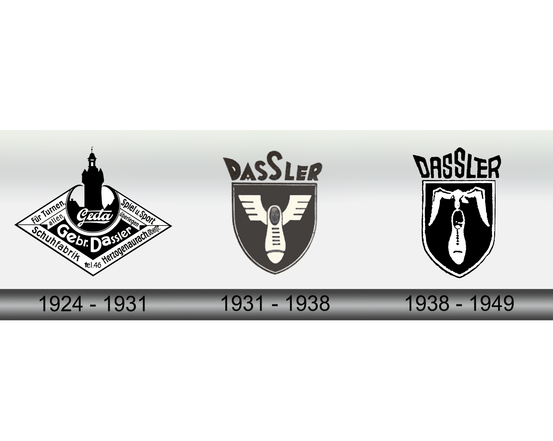
1924–1949: The Dassler Brothers Era
The company originated as the Dassler Brothers Shoe Factory. Its earliest emblem, based on the family crest, featured a bird in flight carrying a shoe, a nod to athletic perseverance rather than modern branding.
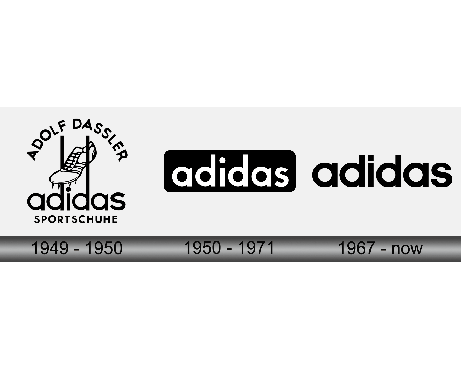
1949–1950: Birth of “Adidas Sportschuhe”
After their split in 1947, Adolf “Adi” Dassler rebranded the company as Adidas (“Adi” + “Dassler”). The first official logo combined a spiked track shoe bracketed by the “d” tails in “adidas,” with “Sportschuhe” (German for “sports shoes”)
1950s–1967: Simplified Wordmark
During this era, the logo shifted toward a minimalist wordmark. Rendered in lowercase sans-serif type, it appeared inside a bold rectangle, simple, functional, and modern.
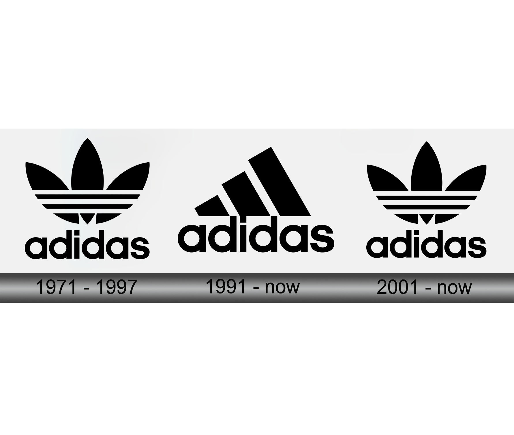
1971–Present: The Trefoil (Adidas Originals)
As Adidas expanded into apparel around 1971, the iconic Trefoil logo emerged. Designed by a German agency team, the logo features three leaf-shaped foils intersected by the three stripes, symbolizing product diversity across the Americas, Europe/Africa, and Asia. Since the 2000s, the Trefoil has been reserved for Adidas Originals as a heritage symbol.
1991 Onwards: The Equipment / Mountain Logo
Under Creative Director Peter Moore, Adidas launched the Performance (Equipment) logo in 1991. The three stripes are slanted upward to form a mountain-like shape, evoking athletic ambition and overcoming challenges.
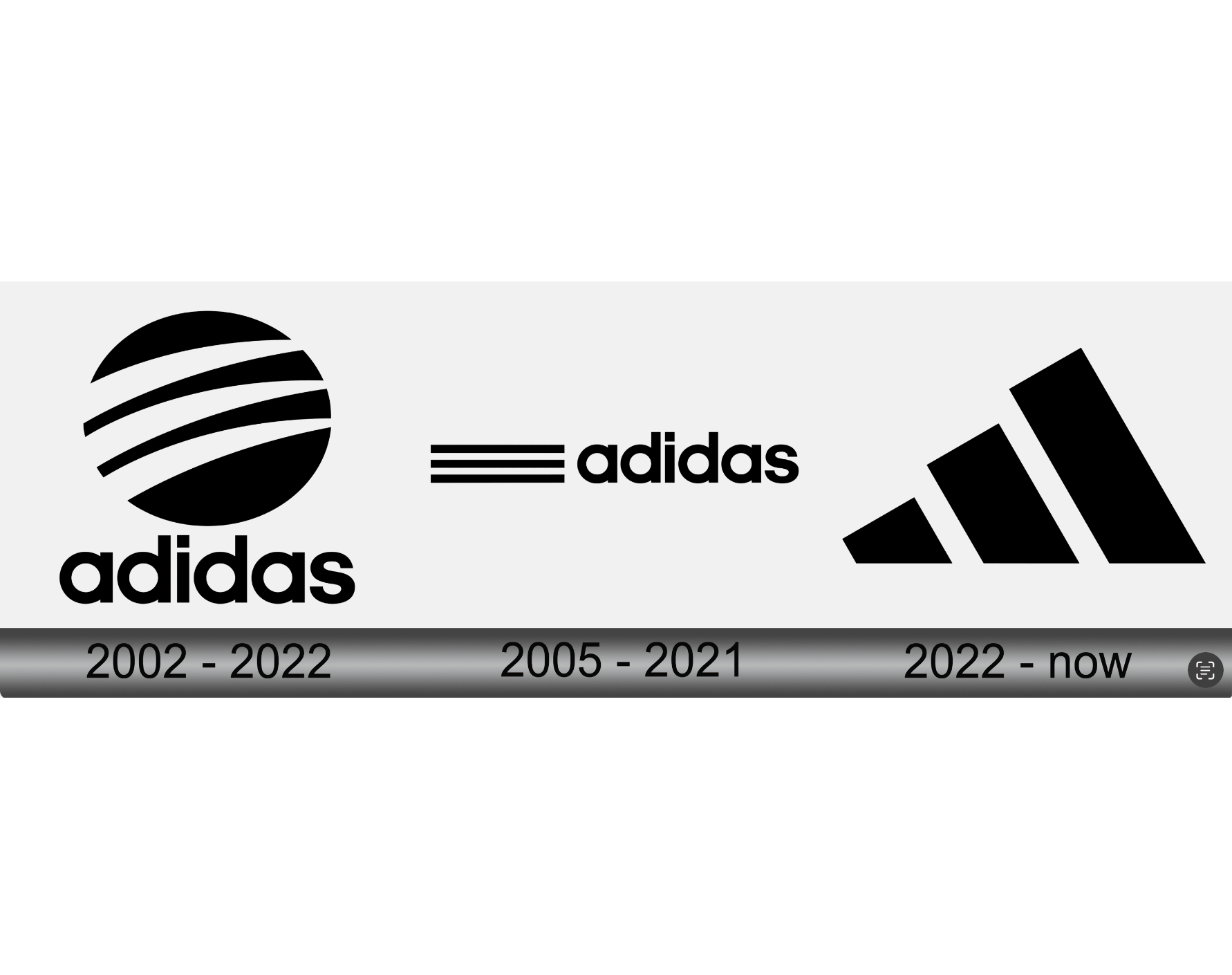
Early 2000s: The “Style” Circle Logo
In the early 2000s, Adidas introduced a fashion-forward logo variant the “Style” logo a circle containing three claw-like stripes that resembled paths or an animal’s scratch. This emblem was often used for collaborations, such as the Y‑3 line by Yohji Yamamoto.
2005–Present: Wordmark + Stripes
Since around 2005, a clean wordmark version has become common: the “adidas” text accompanied by three parallel stripes to its side. This design embraces minimalism, broad applicability, and brand consistency.
2022–Now: Simplified Stripes-First Branding
Recently, Adidas has favoured the standalone three stripes, often without the wordmark, offering a subtle yet powerful emblem that works across digital and physical environments.
Just like Adidas, every brand’s identity has a story. Discover how we’ve guided others on their journey through our visual identity projects.