29/10/25
5 Minute Read
What Makes a Great Website? Balancing Beauty and Function

In today’s digital world, your website is often the very first interaction people have with your brand. It’s your shopfront, your pitch deck, and sometimes even your best salesperson. But what separates an okay website from a truly great one? The answer lies in finding the perfect balance between beautiful design and seamless functionality.
Design That Inspires, Functionality That Delivers
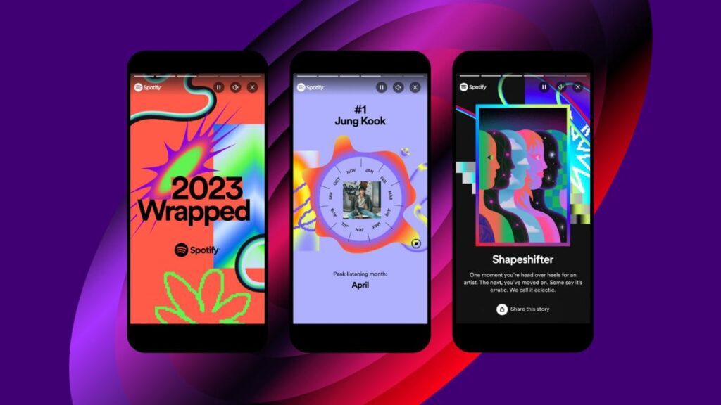
A website should be visually striking, clean layouts, strong imagery, and typography that reflects your brand. But good looks alone won’t keep visitors engaged. A truly great website is also intuitive to use, guiding people naturally from one page to the next. Think of it like a well-designed store: attractive displays pull you in, but it’s the clear signage and easy layout that encourage you to keep browsing.
User Experience Is Everything
User experience (UX) is at the heart of effective web design. A great website should feel effortless. Visitors shouldn’t have to hunt for information, or wonder which button to click next. Menus should be clear, navigation simple, and content structured so users can scan quickly. Overloading visitors with too much information on one page can be overwhelming; instead, break content down into digestible sections and let users choose their own journey. This approach creates that “never-ending loop” effect, where each page leads logically to another, encouraging clicks and exploration. The goal isn’t just to keep people on your site longer, but to help them discover the value you bring step by step.

Calls to Action That Invite Engagement
A website shouldn’t just be a static brochure; it should be a conversation starter. Strategic calls to action (CTAs) are essential. Whether it’s inviting people to join your email list, book a call, get in touch, or visit in person, every page should provide a natural next step. The key is variety: not every visitor is ready to buy, but they may be ready to sign up or enquire. Gentle, well-placed CTAs turn passive browsing into meaningful interaction.
Responsive Across Every Device
It’s no secret that most browsing now happens on mobile. That means your site needs to look and work just as beautifully on a phone or tablet as it does on a laptop. A responsive website adapts seamlessly across screen sizes; layouts reflow, images resize, menus simplify, so the user experience is consistently smooth. Nothing sends people away faster than pinching and zooming just to read text.
The Perfect Balance
In the end, a great website is one that feels both inspiring and effortless. It captures attention with bold, beautiful design, but it keeps people engaged with clarity, usability, and purposeful calls to action. It doesn’t overwhelm; it empowers. And most importantly, it works everywhere your audience might find you, from desktop to mobile.
Your website is more than a digital presence; it’s your brand in action. Make it a place people want to return to, not just visit once.
Useful Design Resources
Need some web design inspiration? Check out some of these sites; one page love, awwwards
Curious how this looks in practice? Take a look at our website design case studies, real examples of how we’ve helped brands create beautiful, functional, and engaging digital experiences.


