With over 30 years experience, more than 3.5 million sq. ft of dedicated warehouse storage and being entrusted to look after over $1 billion worth of cargo, Commodity Centre have become a leader in their field. Whilst the operational side of the business has impressively grown over the years, Commodity Centre felt that their marketing side was letting them down and leaving them behind when it came to their competitors.
After a couple of false starts, they initially entrusted us to work with them on their rebranding, along with the redesign of the Commodity Centre website.
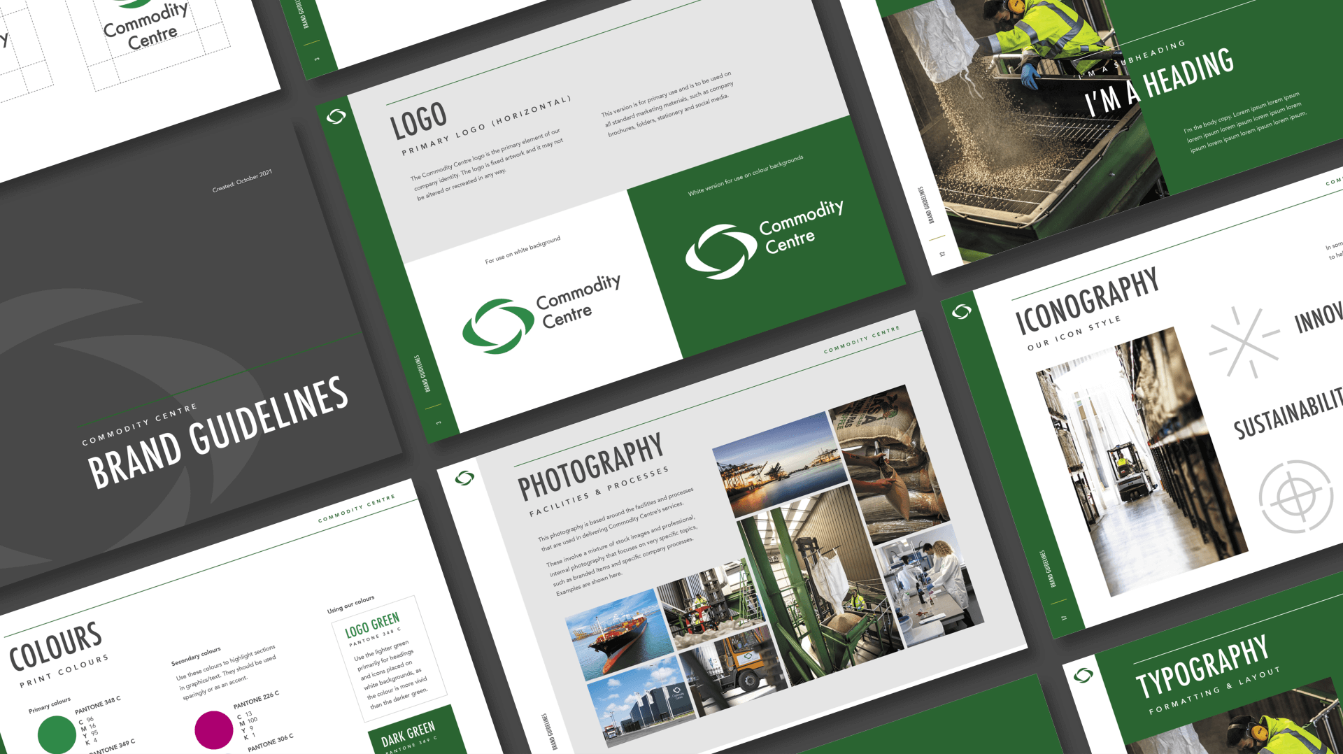
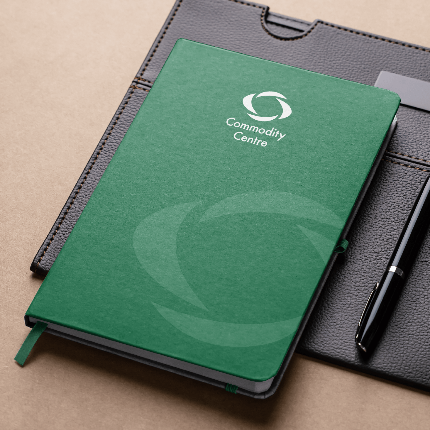
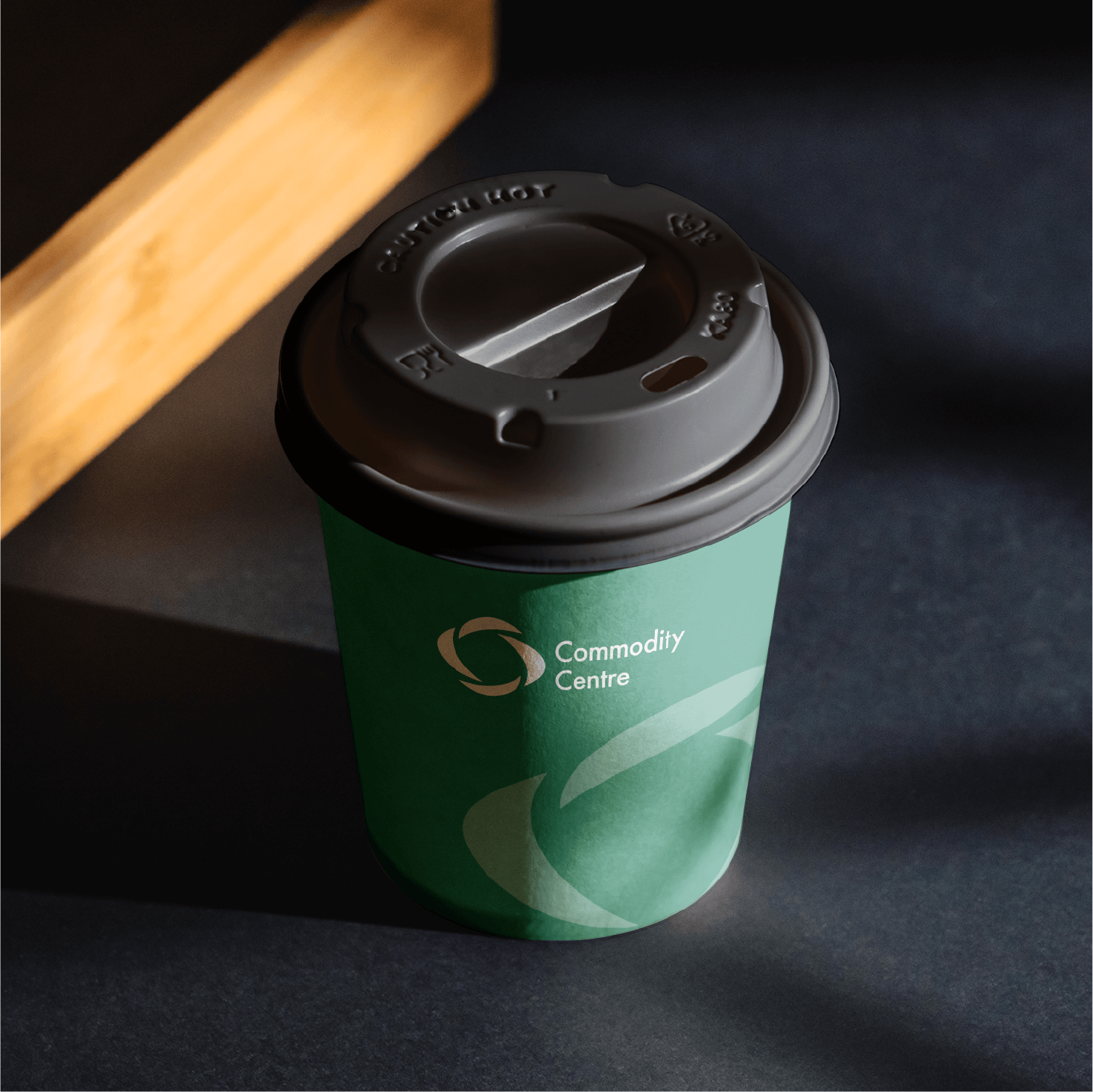
Our first port of call was the rebranding. Whilst we initially embarked down more of a “revolution” route, it was clear that due to Commodity Centre’s established name and branding, especially across their warehouses and large transport fleet, an “evolution” of the brand was to be the best option.
We made subtle changes to the logo, to increase it’s legibility and balance across all applications, along with a reprofile of their “pillars” icon motif. The new logo was matched with a strong font choice to give them a new look & feel, whilst keeping things recognisable; evolution, not revolution.
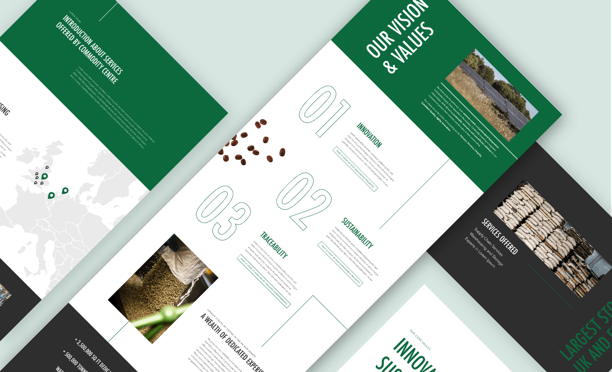
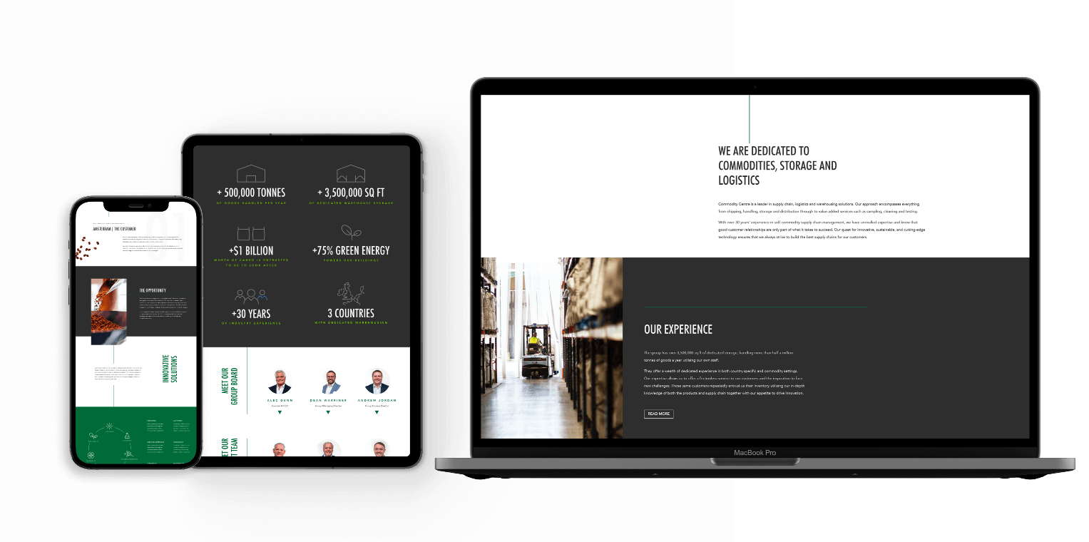
Once the new branding was approved, we moved onto the redesign of the website. This was a complete re-think, as Commodity Centre were never happy with their previous site. We focused around a much improved user journey; key of which was a multi-feature menu to help easily navigate to the various services Commodity Centre offer.
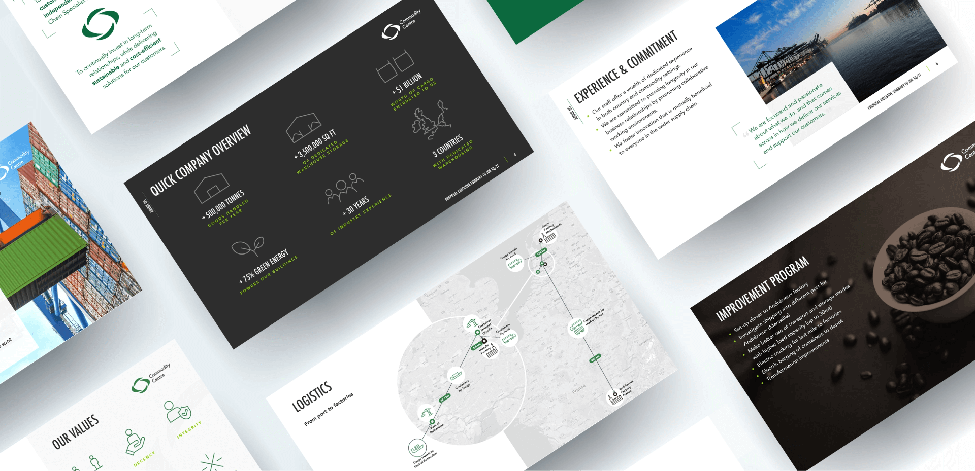
Case Studies were a key feature that the Business Development team desperately needed, but never had the ability to previously add. We designed and developed bespoke Case Study pages, built around the required content and also included a link to a PDF for further reading.